Lato Regular vs Open Sans
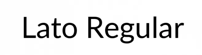
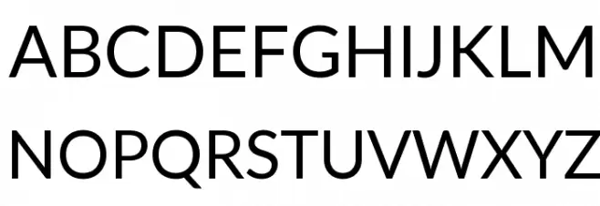
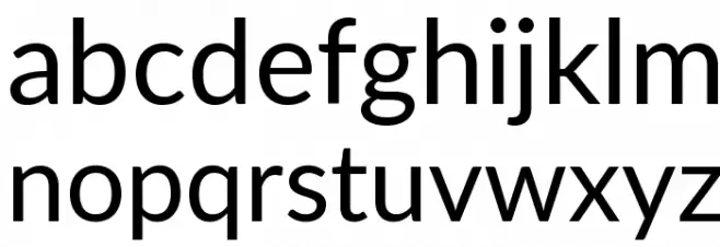
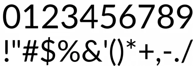
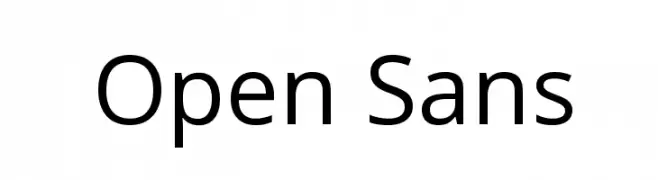
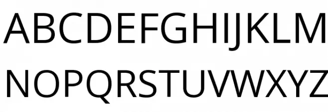
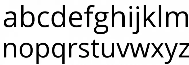
Lato and Open Sans are both humanist sans-serifs designed for screens, but Lato has semi-rounded details and a warmer, slightly narrower feel, while Open Sans is more neutral and wider. At text sizes they are close; at display sizes Lato's calligraphic touches show.
When to choose Lato Regular and when Open Sans
- Choose Lato for corporate sites that want a warm but professional tone.
- Choose Open Sans for maximum neutrality and the widest language support.
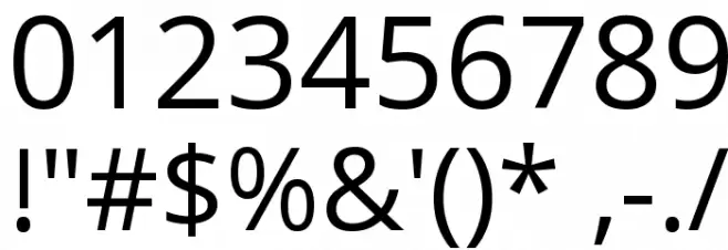
Both fonts are free to download on FFonts.net: Lato Regular and Open Sans. Type your own text above to test both with your headline, and use the waterfall and character views to check every size.
Font Comparison Tool – See Fonts Side by Side
Our font comparison tool lets you view two fonts side by side to help you make better typography decisions. Whether you're choosing between similar serif fonts, comparing a sans-serif with a display typeface, or simply exploring how different fonts render the same text, this tool makes it easy.
How to Compare Fonts
Start typing a font name in either search field above. After 2 characters, a dropdown appears with matching fonts and small preview thumbnails. Click a font to select it, then hit Compare. You'll see both fonts rendered with the same sample text, plus their uppercase, lowercase, and number characters.
Customize Your Comparison
Use the controls above to type your own sample text, adjust the font size with the slider, change the background color for contrast testing, or switch between grid and list layouts. Try the quick sample buttons — Pangram for a sentence using every letter, ABC for the full alphabet, or 123 for numbers and symbols.
Why Compare Fonts?
Choosing the right font is critical for readability, brand identity, and user experience. Comparing fonts side by side helps you evaluate character shapes, spacing, weight, and overall personality before committing to a design. It's especially useful for pairing heading and body fonts, testing readability at different sizes, and checking how fonts look on both light and dark backgrounds.
Share Your Comparison
Use the Copy Link button to share your font comparison with colleagues or clients. The URL contains both font names, so anyone with the link sees the exact same comparison.